The Java Joint App

Mobile app login screen for The Java Joint featuring a cozy coffee shop interior with wooden furniture, plants, and a menu board, and buttons for Log In, Sign Up, and Guest Checkout.

A full UX lifecycle process from research to prototype was completed over the span of several weeks with the goal of developing a mobile application ordering platform for a fictitious coffee company, The Java Joint.

Summary & Stats

Timeline
6 Weeks
Role
Project Manager, UX Researcher & Designer
Tools
Google Workspace, Miro, Canva, Figma

Project Background

This project followed a research-driven design process grounded in user-centered design principles. I focused first on understanding friction points within an existing specialty coffee ordering workflow. By evaluating a comparable premium brand's product and observing real users complete ordering tasks, I was able to identify user pain points and design for a real-world context. My goal was to create a design that reduced cognitive load and made the user task flow as efficient as possible, which is needed for busy, on-the-go users.

Project Goals

Mobile ordering is used in quickly moving, real-world contexts, and even small usability issues can cause friction, abandonment, or loss of trust.

Objective:
 Identify high-impact usability barriers and design a simplified, intuitive ordering flow that maximizes task success and user confidence to create a frictionless mobile ordering experience.

User Research

Competitive Analysis

The Java Joint operates in the premium “third-wave” coffee space alongside brands such as:
  • Blue Bottle – Minimalist, premium, sustainability-focused
  • Stumptown – Direct-trade pioneer that touts a bold and unique brand identity
  • Intelligentsia – High-prestige, appealing to coffee-experts
  • La Colombe – Broader user appeal with modern RTD innovation

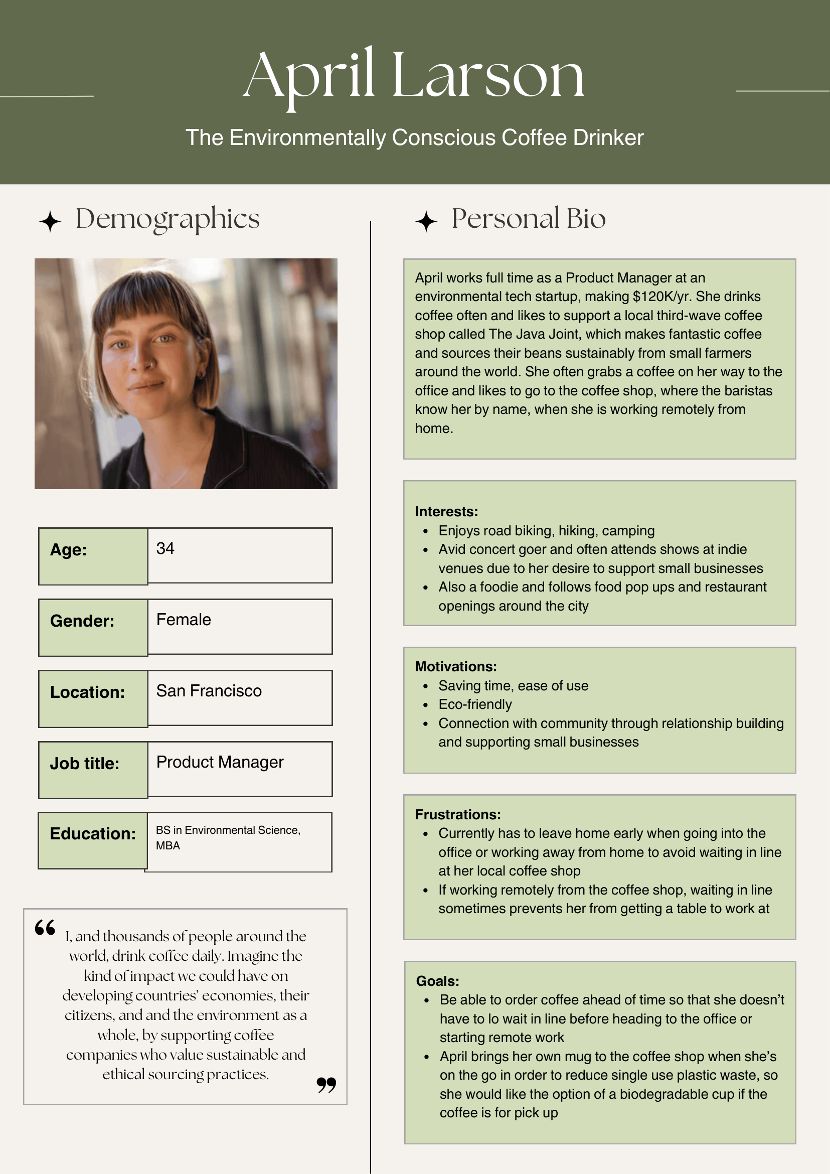
These brands serve educated, high-income, urban customers who value specialty coffee, sustainability, and quality.

The Java Joint needed a digital experience that matched the high standards of larger comparable coffee companies, without adding complexity.

Target Users

Demographics

  • Urban professionals
  • High income, highly educated
  • Frequent coffee buyers

Psychographics

  • Value sustainability and traceability
  • Willing to pay for premium quality
  • Expect efficiency in daily routines
Non-coffee drinkers were screened out.

User Persona

Based on the defined user criteria, a primary persona was created to guide the design process, emphasizing the need for convenience and ease and the importance of highlighting company values. This is an appropriate scenario for considering the target users' needs as it reflects many of the target user demographics/psychographics for The Java Joint (disposable income, in their 20’s-30’s, values sustainable and ethically produced coffee, lives in an urban environment, tech is a common field of work in San Francisco), while also representing a very specific user case (someone who wants a biodegradable cup option when ordering online).
User persona for April Larson, an environmentally conscious coffee drinker, including demographics, personal bio, interests, motivations, frustrations, and goals with a portrait photo.

Usability Testing

Objectives

Identify features that make mobile ordering on the Blue Bottle Coffee app:
  • Efficient vs. inefficient
  • Easy vs. confusing
  • Emotionally attractive

Methods

6 participants (4 male, 3 female) were recruited and screened through my social network (LinkedIn, Instagram, friends/family) to complete moderated remote usability testing consisting of real time moderator observation, participant think-aloud, and moderator follow-up probing for more context on user decisionmaking.

I chose to utilize moderated remote usability testing over a Zoom meeting, with the participant's face and device screen recorded, as this reflected a more realistic usage condition and was logistically easier with limited resources. Moderating the study allowed me to observe user facial expressions and thought processes in real time, with participant think aloud clarifying decisions. A smaller sample size was also appropriate for limited resources and the formative research stage for initial product design, where I wanted to focus on identifying user issues rather than producing statistics.
Blue Bottle Coffee app icon showing a blue bottle silhouette and app description stating Connect to delicious coffee, only for iPhone, free.

Tasks

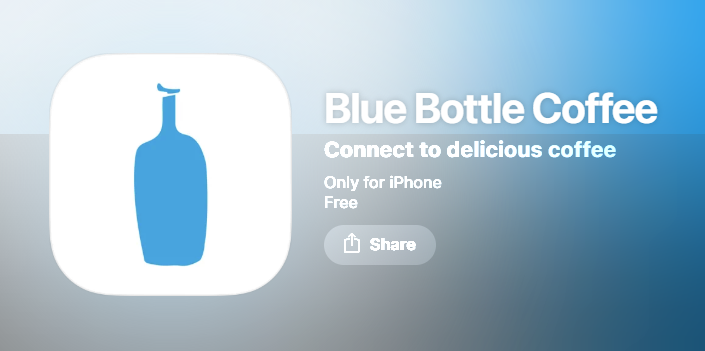
Participants were asked to download the Blue Bottle Coffee app on either an IOS or Android phone and:

  1. Create an account
  2. Find the closest cafe
  3. Add, remove, and modify specified items in an order
  4. Proceed to checkout
Outdoor seating with two small tables and chairs in front of Old Oakland cafe with large windows and white architectural columns.Menu to choose a cafe location with options including Northern California, Southern California, Boston, New York, Washington D.C., Chicago, Las Vegas, and a button to use location.White cup of caffe latte with leaf-shaped latte art on a gray surface.Mobile order review screen showing a 12oz caffè latte with oat milk, no sugar, priced at $6.75, from Old Oakland at 480 9th Street with estimated pick-up in 7 minutes, payment and gift card options to add, and a $1 barista tip for a total of $7.75.

Metrics

Primary

  • Task completion rate - this has major implications for business goals, as higher completion rates correlate with increased conversion (successful transactions) and lower cart abandonment
  • Error rate - high error rates could suggest user frustration and reduces trust in the brand, so reducing this number supports customer retention and brand credibility

Secondary

  • Time on task: since the app context is for people who want a quick and easy method for having their coffee ready when they need it, it was important to understand the time it took to complete the task flow
  • Self-reported satisfaction: user satisfaction was gleaned to understand how using the app made users feel

Research Synthesis

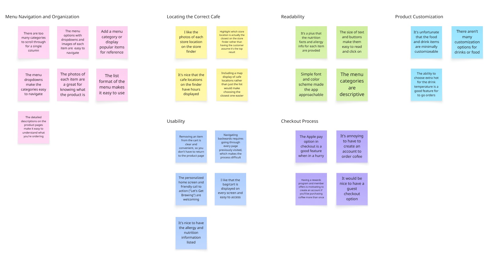
Summarization of research findings consisted of combining behavioral data with qualitative insight. I completed the following steps to ensure that my design decisions were evidence based:

  • Reviewed recordings + moderator notes
  • Identified recurring breakdowns and patterns
  • Grouped issues experienced and comments across participants using affinity mapping
  • Prioritized issues using a severity framework, with those with the highest frequency and severity taking priority
Affinity map with color-coded sticky notes categorizing user feedback on menu navigation, cafe location, readability, product customization, usability, and checkout process for a cafe app.

Key Findings

  • Account requirement was unclear — Users added items before realizing login was required
  • Store selection was unintuitive — Users struggled to confidently identify the closest location
  • Navigation friction was present— Users had difficulty moving backward between pages increased cognitive load and time on task

Design

Based on findings, the app was redesigned to:
  • Introduce a welcome screen with clear entry points to increase visibility of system requirements (Login / Sign Up / Guest Checkout options).
  • The store finder was redesigned to reduce cognitive guesswork and make proximity clearer, applying recognition over recall and preventing the need for user inference.
  • Add persistent back navigation for clearer return paths and user freedom, allowing users to easily recover from mistakes.

Lo-Fi Wireframe

Mobile app screen for The Java Joint showing a cozy coffee shop interior with wooden stools and green plants, and buttons for Log In, Sign Up, and Guest Checkout.Mobile app screen titled 'Find Your Cafe' displaying a search bar and a list of cafes with images and addresses in San Francisco and San Diego.Mobile app screen showing coffee shop menu with sections Bestsellers, Beverages, and Food featuring vanilla latte, cold brew, banana bread, americano, espresso, pour over coffee, avocado toast with eggs, bagels with cream cheese, and a croissant.Vanilla latte in a clear glass cup on a matching saucer with latte art on top, priced at $5.00.

Hi-Fi Prototype

The Java Joint design system showing colors Espresso to Matcha with hex codes, typography styles from 40px to 16px, button states including Primary and Secondary, a profile icon, a search input, and input fields for email and card number.
Mobile app screen for The Java Joint showing a cozy coffee shop interior with wooden stools and green plants, and buttons for Log In, Sign Up, and Guest Checkout.Mobile app screen titled 'Find Your Cafe' displaying a search bar and a list of cafes with images and addresses in San Francisco and San Diego.Mobile app screen showing coffee shop menu with sections Bestsellers, Beverages, and Food featuring vanilla latte, cold brew, banana bread, americano, espresso, pour over coffee, avocado toast with eggs, bagels with cream cheese, and a croissant.Vanilla latte in a clear glass cup on a matching saucer with latte art on top, priced at $5.00.

Final Product

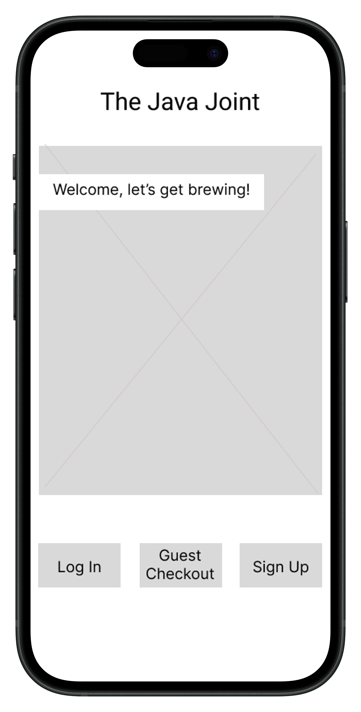
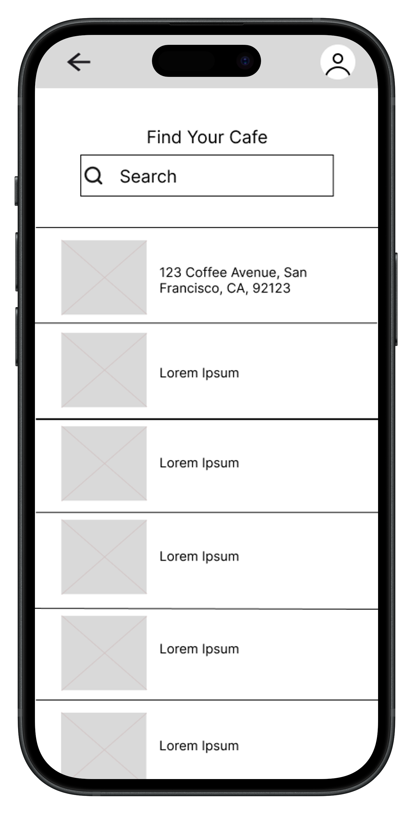
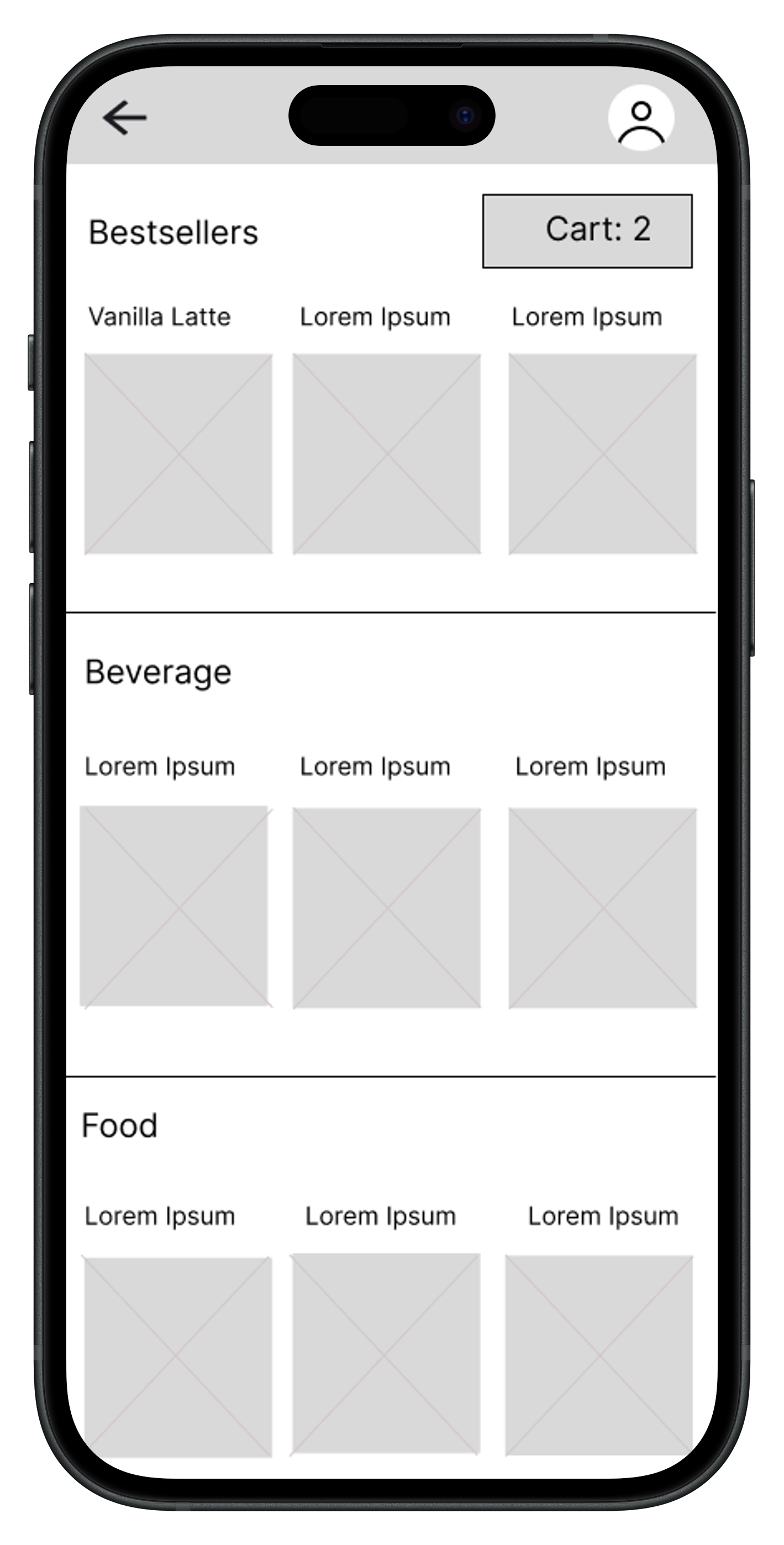
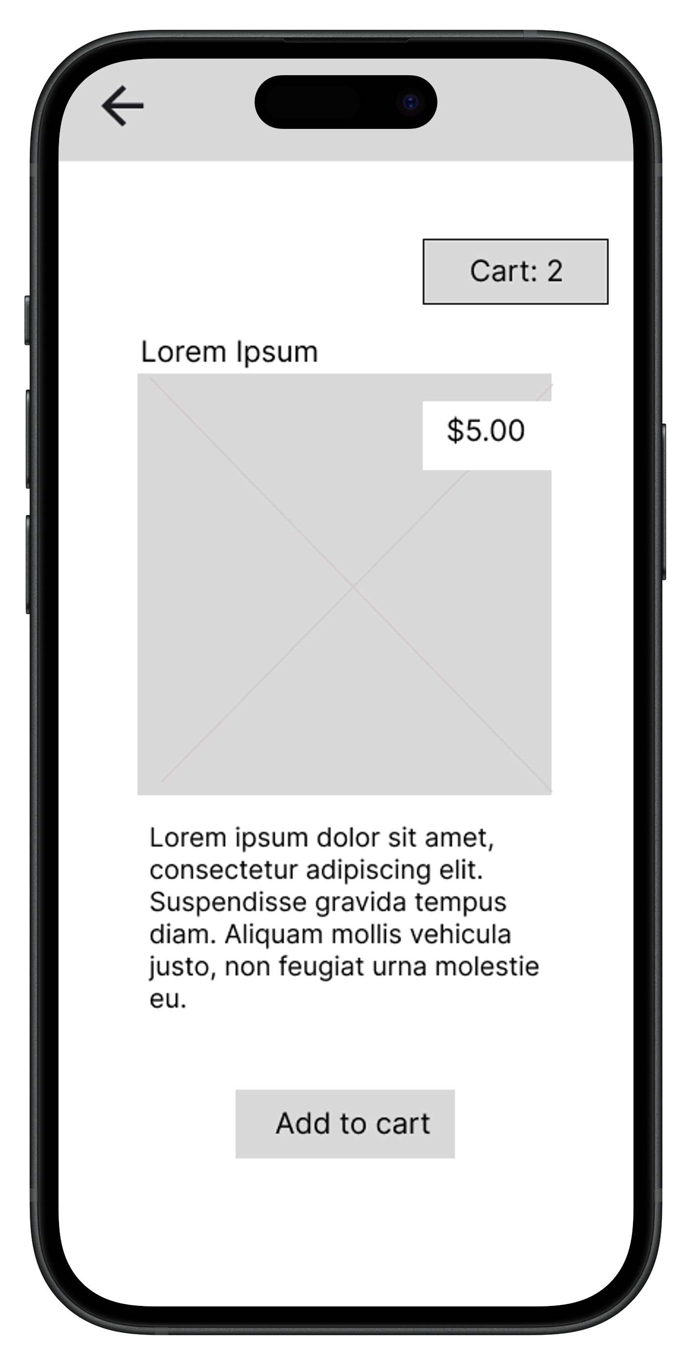
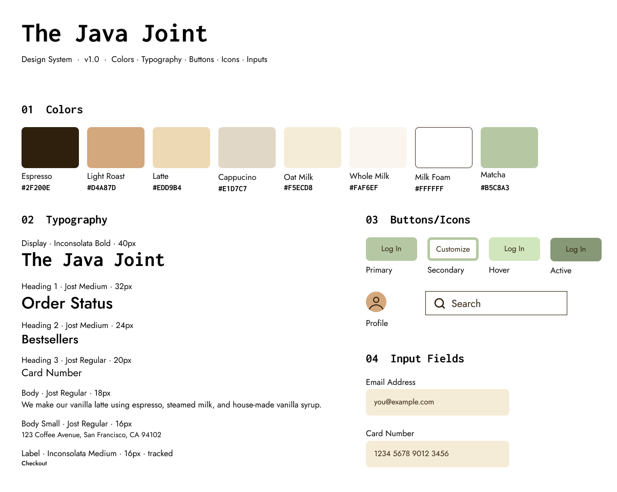
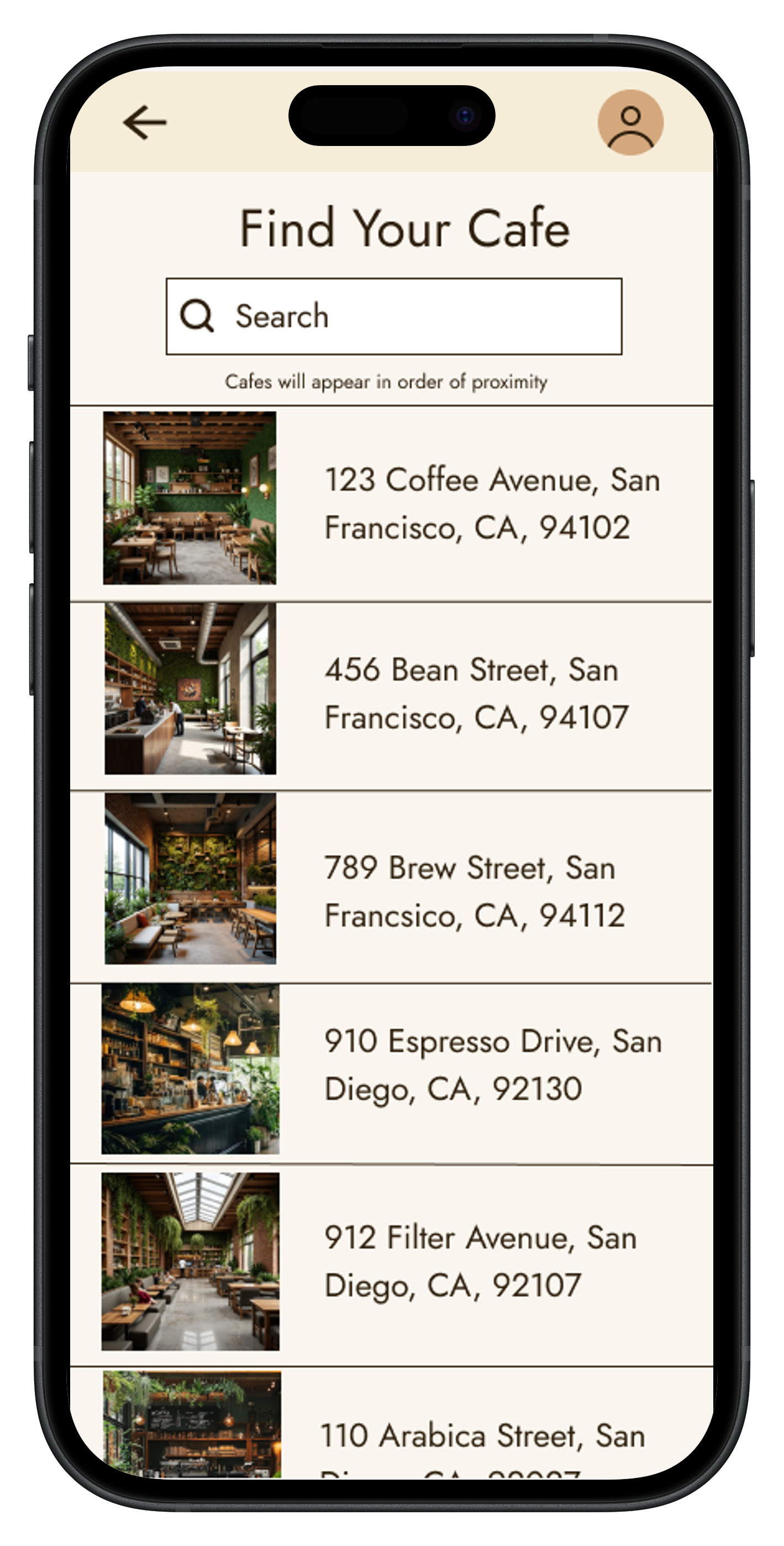
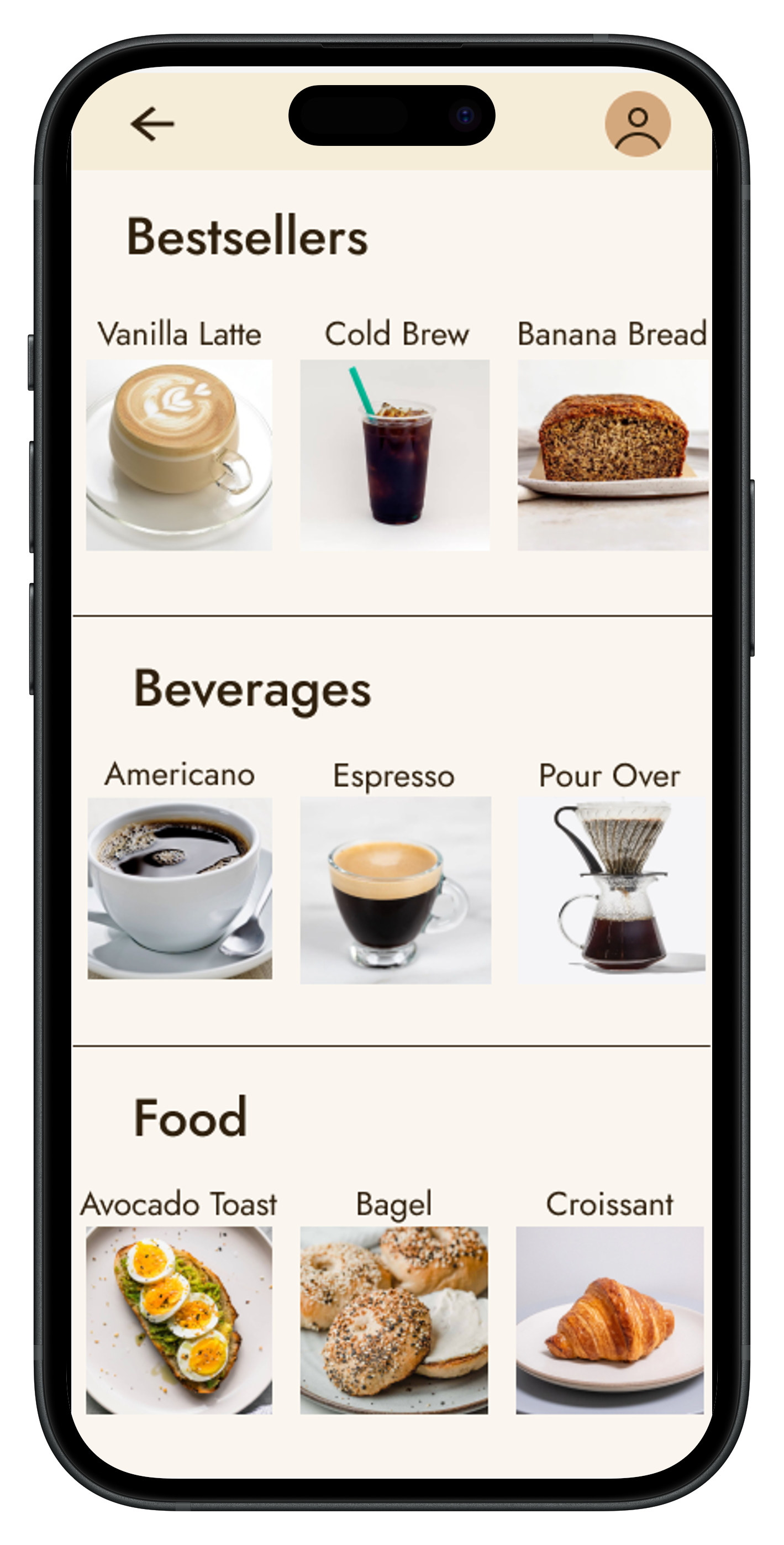
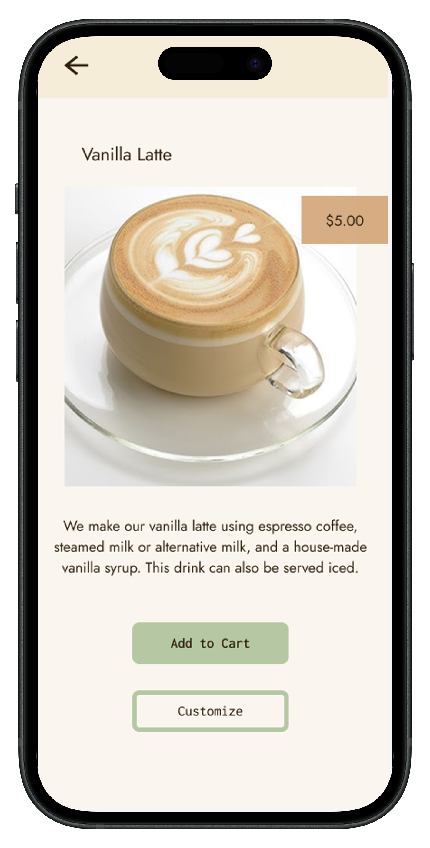
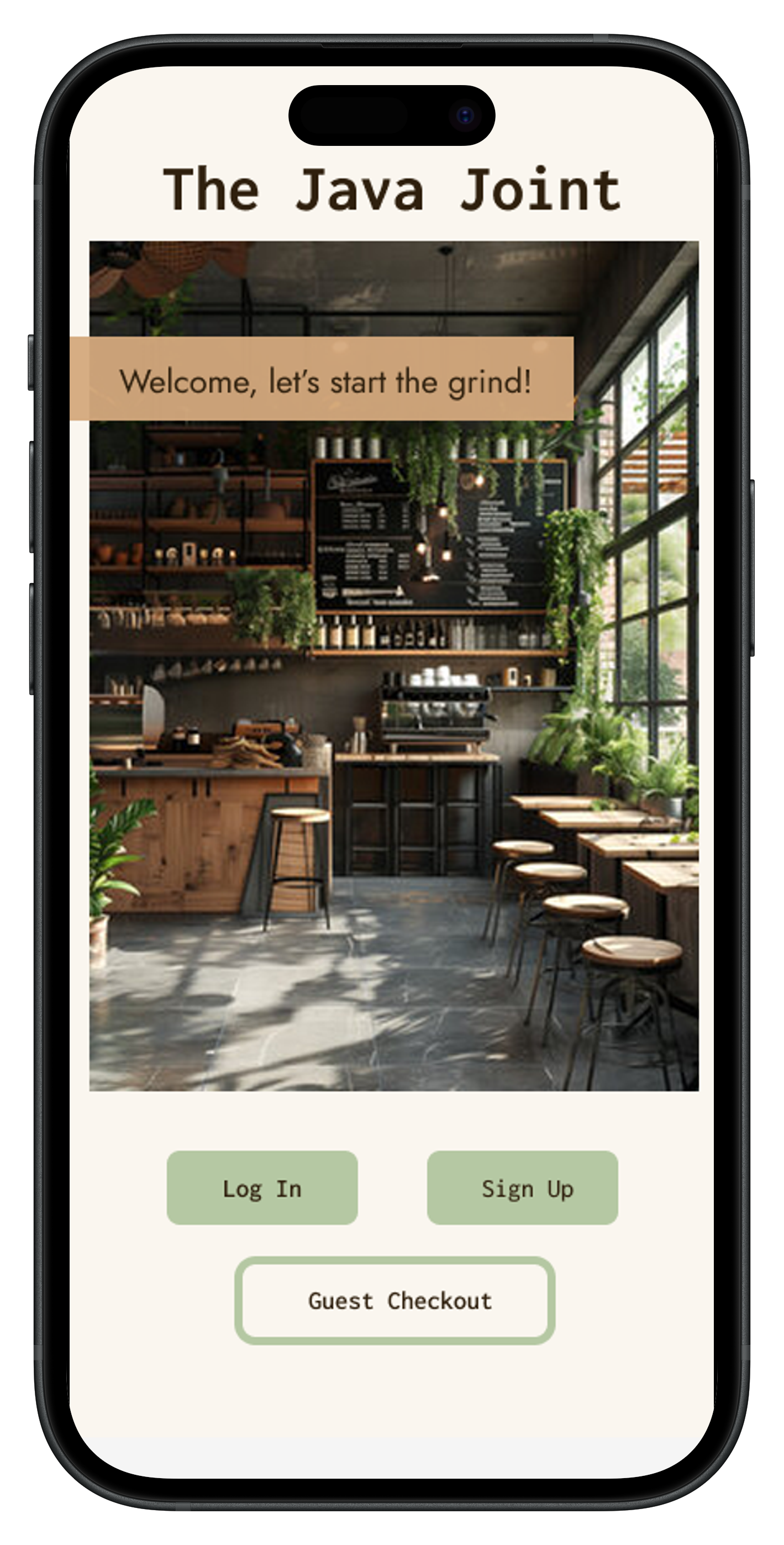
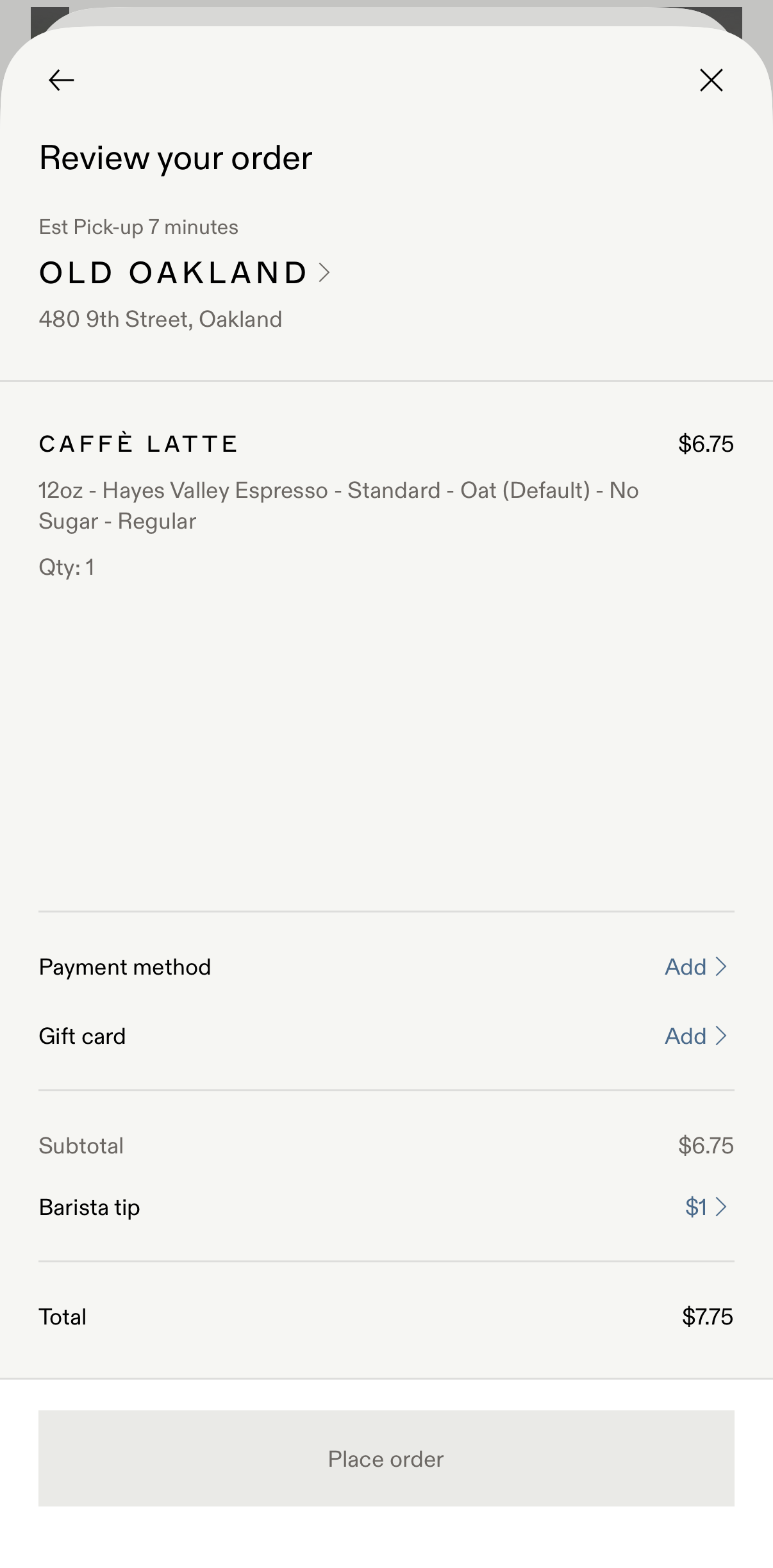
The final app layout was designed to reflect usability principles. It establishes clear entry points on the welcome screen, persistent back navigation, and an easy to navigate menu that applies the aspects of the competitor's product that users enjoyed.

Conclusions

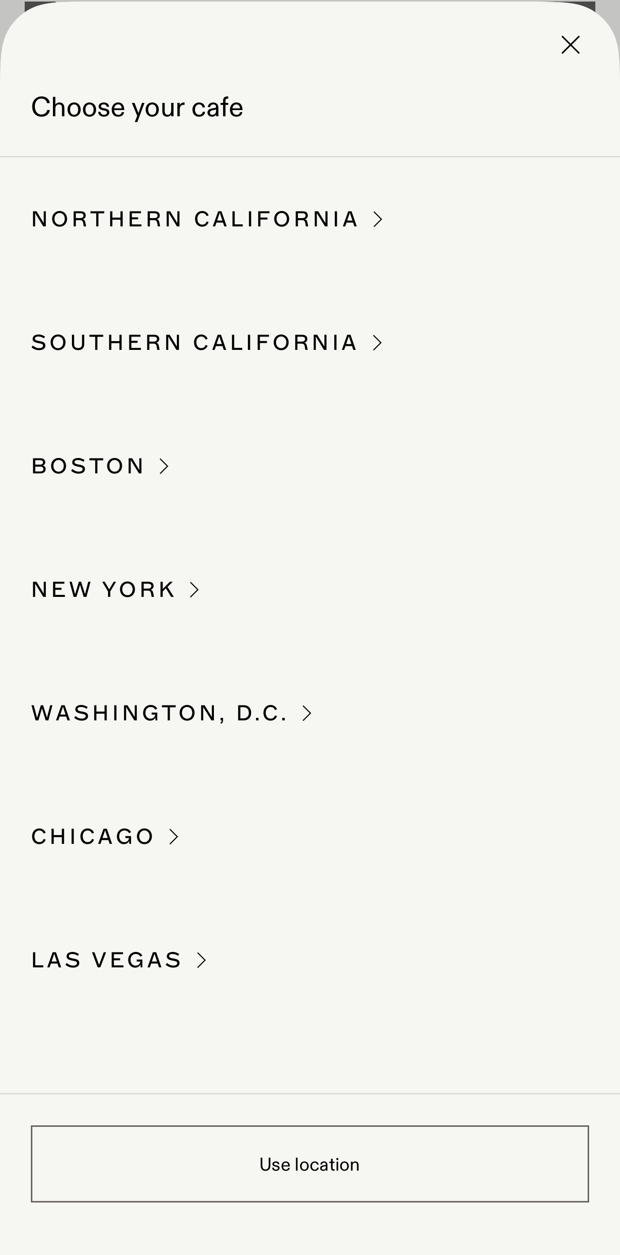
At first glance, the Blue Bottle mobile app seemed intentionally designed, with a minimal aesthetic that fits the company’s brand, and features that align with user tasks for mobile ordering.

However, conducting user research led to the understanding that even well-designed apps can be improved. It also highlighted the aspects of the mobile ordering experience that draw users ein, like clear organization, simple font and imagery, and easy navigation across pages.

The final prototypes for The Java Joint app reflect the needs and wants of users ordering coffee online, allowing them to utilize guest checkout, and navigate the task flow without frustration.

Due to the nature of this as an individual academic project, I did not have all resources at my disposal. If I had more time available, I would have added more features such as a map feature on the cafe locator screen, and built out the prototype further. I would have also conducted a usability evaluation with a new sample on The Java Joint’s app design itself and made design adjustments based on that data, with further iterations as needed.

View Next Project
Back to Top