
Case Study
A full UX lifecycle process from research to prototype was completed over the span of several weeks with the goal of developing a mobile app and desktop website for a fictitious outdoor gear and clothing resale company, Adventure Loop.
Adventure Loop was built to make outdoor activities more affordable and environmentally conscious. The platform addresses key shortcomings of existing competitors like poor navigation, cluttered interfaces, and limited product variety by offering an intuitive, modern shopping experience spanning a wide range of outdoor gear and apparel across all major brands.
The primary goal of the Adventure Loop site was to raise awareness of the brand and build a loyal customer base by delivering an ecommerce experience comparable to major outdoor retailers. Key objectives included increasing conversion rates through simplified navigation, building user trust in the secondhand gear vetting process, encouraging repeat purchases, and enhancing brand visibility through SEO and sustainability focused marketing. The site was also designed to be fully responsive across desktop, tablet, and mobile, prioritizing accessibility in line with WCAG 2.1 AA standards.
Adventure Loop's target audience is primarily adults aged 25–35 based in the United States, with interest in outdoor activities such as skiing, hiking, biking, snowboarding, climbing, and water sports. Users tend to be budget conscious shoppers comfortable navigating ecommerce sites, with experience purchasing secondhand gear online or in person.
Users value environmental sustainability and are interested in secondhand shopping for both affordability and positive social impact. They may be starting a new outdoor hobby or be seasoned recreationalists who want to reduce their carbon footprint and waste. All share a motivation to make outdoor recreation more accessible and eco-conscious.
Adventure Loop's primary direct competitors are outdoor gear resale platforms, both general and brand specific. The table below outlines key differentiators across product overview, features, mobile experience, competitive advantages, and weaknesses.
| Brand | Product Overview | Feature Analysis | Mobile Experience | Competitive Advantage | Weaknesses | |||||
|---|---|---|---|---|---|---|---|---|---|---|
| Adventure Loop | Outdoor gear resale marketplace | Category filters, condition details, multiple images | Modern, responsive, mobile optimized interface | Outdoor resale focus with product variety | New, unestablished brand | |||||
| Direct Competitors | ||||||||||
| Geartrade | Outdoor gear resale marketplace | Gear filters, product variety | Responsive but dated interface | Large resale inventory | Cluttered interface | |||||
| Patagonia Worn Wear | Patagonia certified used gear | Condition certified, repair program | Clean responsive ecommerce | Strong sustainability brand | Brand-limited inventory | |||||
| Cotopaxi x Thredup | Cotopaxi apparel resale | Size filters, sorting tools | Mobile optimized resale platform | Brand resale partnership | Brand-limited inventory | |||||
| Arc'teryx ReBird | Arc'teryx repair and resale program | Repair program | Modern responsive ecommerce | Premium gear refurbishment | Brand-limited inventory | |||||
| The North Face Renewed | Refurbished North Face gear | Condition certified | Clean responsive retail design | Trusted brand quality | Brand-limited inventory | |||||
| Indirect Competitors | ||||||||||
| REI Re/Supply | Used gear resale program | Ability to view in person | Strong responsive retail UX | Retail + resale ecosystem | Limited inventory, in person only | |||||
| Facebook Marketplace | Peer-to-peer resale marketplace | Basic search, messaging tools, view in person | Strong mobile app experience | Large user network | Potential low trust, in person only | |||||
| Poshmark | Social fashion resale marketplace | Brand filters, social selling | Mobile-first marketplace design | Large resale community | Not outdoor-focused | |||||
| Depop | Trend-driven resale marketplace | Social discovery browsing | Highly optimized mobile app | Popular with younger users | Not outdoor-focused | |||||
Adventure Loop's brand tone is sustainable, adventurous, accessible, and trustworthy. The brand reflects values of environmental sustainability, spreading awareness of secondhand shopping's positive impact, making outdoor recreation accessible, maintaining natural environments for future generations, and pursuing adventure in the outdoors. The visual identity draws directly from natural environments.
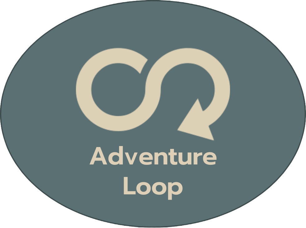
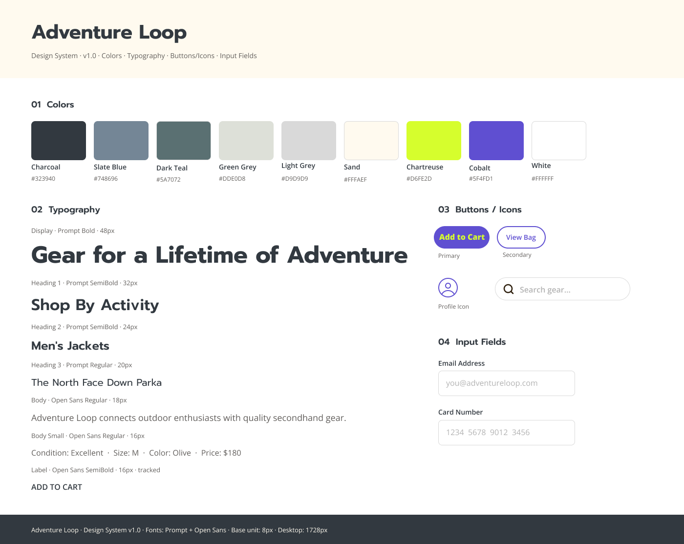
The Adventure Loop logo was designed to reflect the outdoor lifestyle and sustainability through its iconography. The arrow infinity loop implies recycling while mimicking the shape of a ski path, connecting the brand's environmental ethos to the action sports world. The color palette conveys trust and connection to nature through earth tones.
The primary palette consists of sage green, slate blue, dark teal, and light sand, which are muted earth tones evoking natural environments, trust, and calm. These are used in the logo and main site elements including the navigation header, menus, and background cards. The secondary palette uses chartreuse and cobalt blue as accent colors to reflect the energy of action sports, applied to icons, CTA buttons, and text highlights.
Headings use Prompt, a geometric sans-serif typeface with condensed, rounded letters. Body text uses Open Sans, a sans-serif known for high legibility and a neutral, modern appearance. Together they contribute to the clean, modern aesthetic and accessibility of the site. The minimum body text size of 18px also supports readability and WCAG 2.1 AA compliance.
A moderated remote usability study was conducted with 6 participants (2 women, 4 men, aged 25–35) via Zoom. All participants had experience with ecommerce, outdoor recreation, and buying secondhand gear. Six tasks focused on site navigation were administered using a think-aloud protocol, followed by moderator debrief questions.
Primary metrics included Task Success Rate, Error Rate, Single Ease Question (SEQ) scores assessed after each task, and post-test System Usability Scale (SUS) scores. Secondary metrics included self-reported satisfaction ratings and time on task. SUS score results are depicted below.
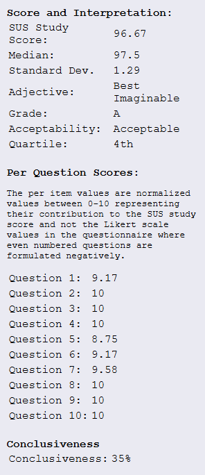
All 6 participants successfully completed all tasks, though some took indirect paths. High priority issues included difficulty locating secondary product categories, uncertainty when returning to the homepage, and extra steps added by navigating to checkout instead of the shopping bag. Lower priority, but still crucial, issues included the lack of ability to filter by product type and lack of detail on product cards.
Based on usability testing findings, several design changes were made in iteration v1.2. The navigation menu interaction was updated to expand subcategories on hover rather than automatically on open, aligning with user expectations. A ‘Back to Homepage’ button was added at key points in the task flow (checkout and order confirmation pages), styled as a secondary button to maintain clear action hierarchy. Body text was increased from 16pt to 18pt and subheading size from 20pt to 24pt to improve readability. CTA button font size was increased from 20pt to 22pt with extra-bold styling for greater prominence. Product type was added as a new filter category to improve product discoverability and reduce reliance on navigation alone. Additional product information (color, size) was added to product cards to help users evaluate items without navigating to individual product pages.
These improvements are expected to result in a higher task completion rate, fewer navigation errors, and improved overall user satisfaction and perceived usability. With the primary issues addressed, task completion time is also anticipated to trend toward the standard ecommerce session average of 2–5 minutes.
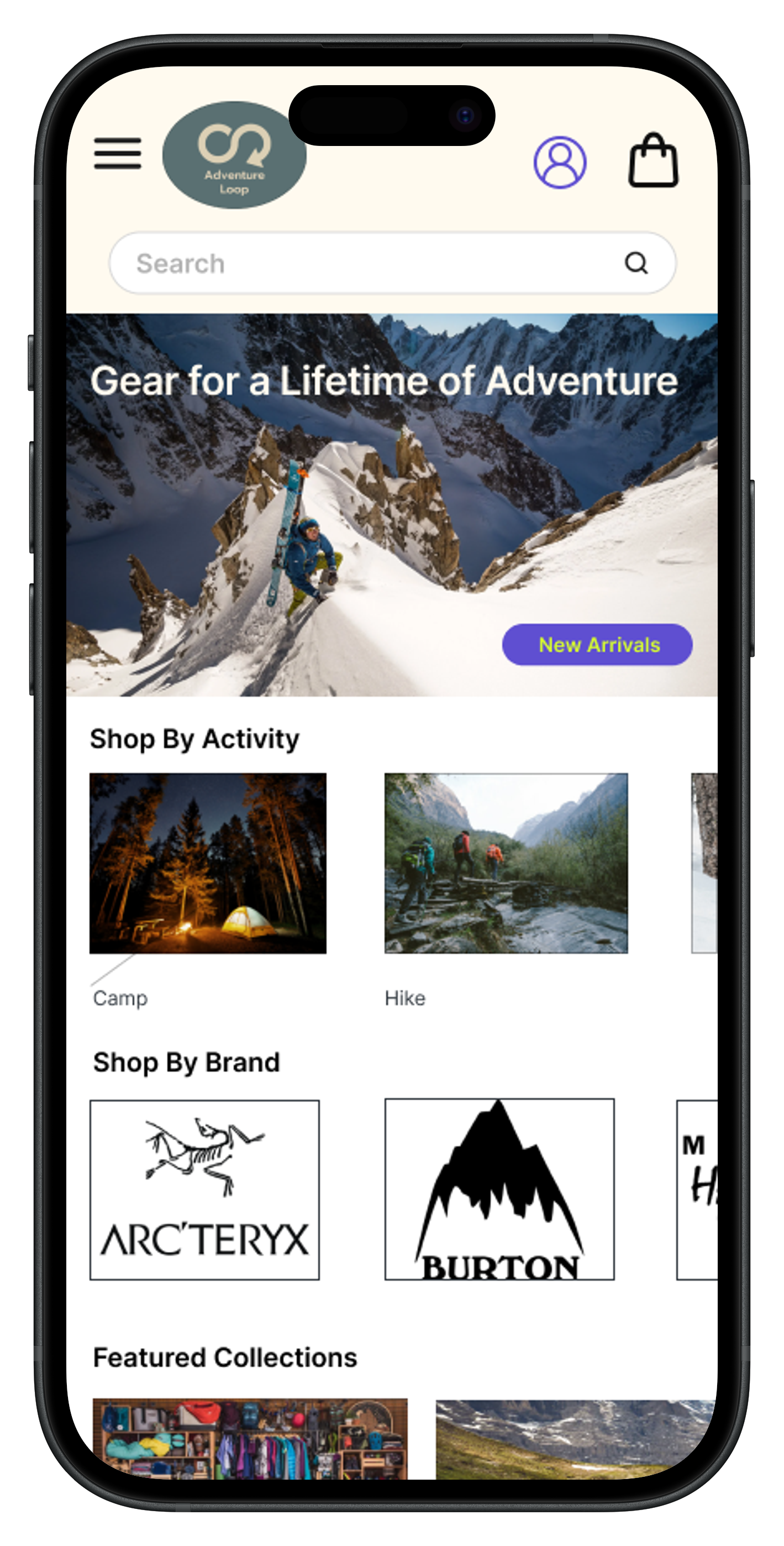
The navigation was designed with a horizontal top bar for category hierarchy and a header search field, allowing users to find products efficiently. Large visual product categories were organized by activity, brand, and featured seasonal categories and clearance. The navigation menu was later updated to follow a hover-to-expand interaction, separating main categories from subcategories to match user mental models.
A large hero image draws the eye to the tagline and primary CTA button. High contrast colors and consistent typography reinforce visual hierarchy across the site. Differentiated heading and body text, combined with intentional use of whitespace and grouping, help users navigate related categories with ease.
User reviews are prominently displayed as social proof, and high quality imagery maintains a consistent, professional aesthetic. The site's modern, clean layout mirrors the standards set by established outdoor brands, building trust in a new platform selling secondhand gear.
The final app layout was designed to reflect usability principles. It establishes clear entry points on the welcome screen, with clear button hierarchy. The site has persistent back navigation and breadcrumbs for better undertsanding of the site architecture, and an easy to navigate menu that always appears in the top header, as well as footer links.